The Dutch e-bike startup VanMoof was known for making and selling city bikes packed with technology. In 2020, the company launched its 3-series bikes. Two years later, we needed to follow up strong with the next generation of our already best-in-class product. This time, we started with the riding experience.
The Situation
In the two years between the 3-series and the next generation of e-bikes, VanMoof had experienced rapid growth both in terms of scale and maturity. We knew where we had succeeded and where we had fallen short with the S3 and X3, and we commited ourselves to delivering new products that focused on quality, accessibility, and the same level of innovation that the industry had come to expect from us.
The Challenge
Designing connected experiences is challenging in that hardware requires decisions to be made early in the development process. There is very little room to iterate based on user feedback. This is in stark contrast to software, where an agile approach means constant iteration based on discovery of business requirements, technical constraints, and user needs. The Experience Design team worked to bridge this gap and to ensure that the decisions of hardware didn’t paint software into a corner, while using software (and firmware) to optimize for flexibility in our hardware decisions.
The Process
Hardware Alignment
Establishing high-level system and principles to set us up for success through refinement and execution
App Redesign
Rearchitecting the app to accommodate new features to support a new type of riding
User Feedback
Validating design concepts with users to ensure our overarching interaction model was intuitive.
Hardware Alignment
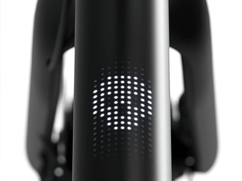
The decisions around the S5 and A5 hardware were driven by Industrial Design collaborating with Experience Design to determine rider interactions and visual/audio feedback. We had the challenge of needing to lock down on buttons and displays without validation from our riders, so our approach was to ensure that we covered a handful of obvious scenarios while pushing for flexibililty in hardware so that we could react to user needs and adapt functionality as we refined through execution.
How did we choose which scenarios were most important? Previous bike models had a low-fidelity matrix display, capable of communicating numbers and icons with lightweight animation. The app’s role in the rider experience was minimal. A rider could access basic information about their bike and rides, unlock, and adjust settings. The strategy surrounding the app was to get it out of the way so that riders could just ride; however, as we extended to new markets and audiences, it was time to rethink this approach.
Starting a representative collection of personas, we grouped our riders into two very different types of people who we knew were using our product – those who just want to get from A to B and those who want a little bit extra, whether that comes in the form of guidance or information. So the S5 and A5 became a story about two different ways of riding: feeling and knowing.
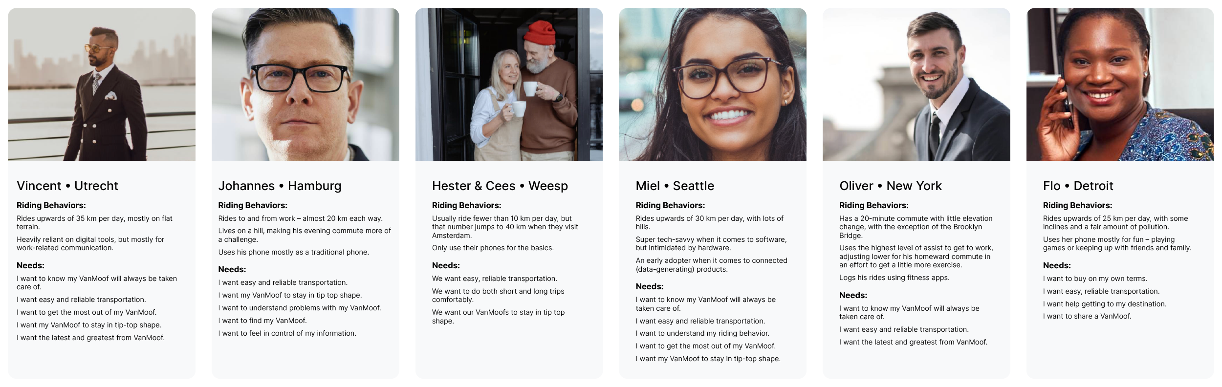
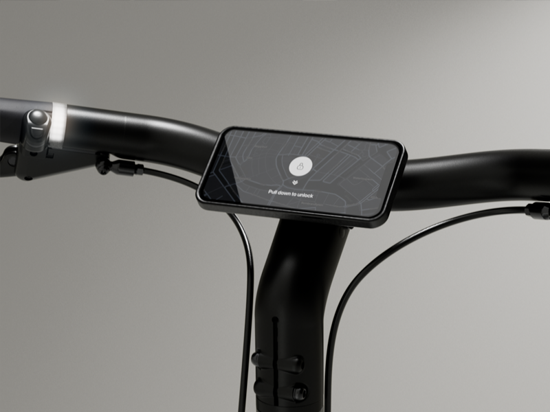
We’d always catered more toward the feeling riders, people who knew where they were going and didn’t care about their stats, but as we expanded to new audiences, we needed to think about the features that our riders were using, such as navigation and ride tracking. With this in mind, we added a phone mount to the bike and overhauled the app to create a platform for these new features.
As we worked with our Industrial Design, Engineering, and Supply Chain teams, availability and cost were sometimes at odds with our design proposals, but clearly prioritized principles and a list of must-cover scenarios helped all teams to align around acceptable compromises. With hardware decisions made, we moved into our first round of prototyping and validation testing, quickly preparing for mass production.
App Redesign
While the development team worked on the backend and connectivity, the design team ran ahead with UI design, establishing a system and an architecture that would refocus the app on the things most accessed and most important to our riders.
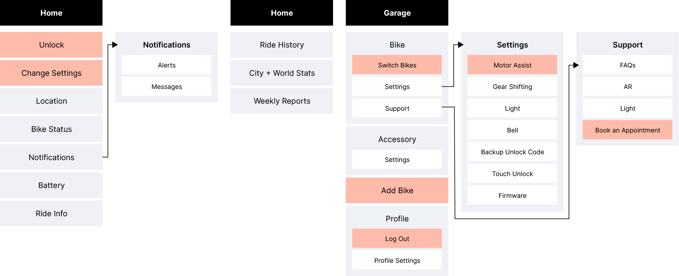
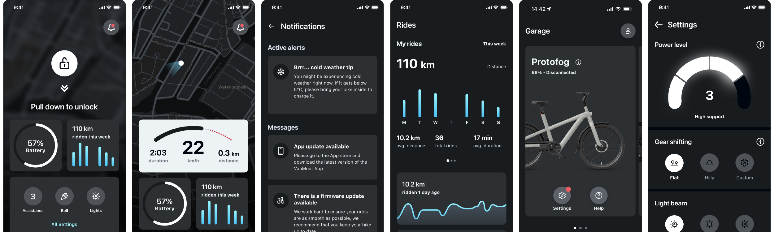
The biggest change was the introduction of a rich homescreen with widgets. We designed dozens of possible widgets, from weather to air quality, focusing on a core few for launch. This included battery, rides, and settings, which all served as entry points into those parts of the app.
We also created a system of notifications so that we could provide our riders with relevant feedback and information with varying levels of urgency. We introduced a framework categorizing messages from promotional to informational to critical, demanding the appropriate amount of attention for each.
Once we had a high level design with flows that were validated via lightweight user testing, we worked with the product owner of the app to create release milestones, loosely aligned to Marketing and Hardware timelines.
User Feedback
Because we were making significant changes to way riders would navigate the app, what they would see on their home screen, and how they would access key features, it was important that we get user feedback early and often. While we were regularly doing lightweight usability testing with friends and family, we also planned to use each of our release milestones as a checking-in point to make sure that changes landed well and that our priorities for subsequent releases were aligned to our riders’ expectations.
One of the first places we sought to gain confidence through user testing was with the bike interface. There were competing camps around interactions, and we needed to gain confidence despite not yet having hardware to test on. We created an entirely-digital prototype and tested with friends and family. The feedback made it clear how we should proceed. We aligned and rode on to our next challenge.
User feedback also proved useful after our first release milestone where we launched the new app structure. We’d moved bike settings an additional tap away for our riders, which perhaps would not have been a problem if it weren’t for many of our riders trying to adjust settings while on the move. With our assumption proved incorrect, we scrambled to see how we could reprioritize to get the settings widget on our app’s home screen out sooner than originally planned. We reshuffled priorities and worked together with development to hurry our next release, after which our app store feedback became more about celebrating the redesign rather than complaining about changes.
Iterations were easy with the app; however, with printed material like manuals, it’s more difficult to react to user feedback. We used learnings from previous manuals, tested early with users, and then worked with our team in Taipei to reduce batch sizes so that we could more easily incorporate user feedback when it came in. We then worked with our Operations team to ensure that we were proactively reaching out to our first riders to get feedback on the unboxing and assembly experience.
Outcomes
Despite hardware and software experiences being made at different points in the stressful product development timeline, we managed to ship a cohesive experience around our connected product. The flexibility we created early in the process has served us well and will allow us to experiment and improve based on user feedback.
Most of the early feedback around the 5-series e-bikes is positive. For the press and our early adopters, the new riding experience is a significant improvement on our previous model.
Takeaways
Understand Feasibility Early
Knowing what I know now, I would work with the Industrial Design and Engineering teams do more low-fidelity prototyping of potential solutions as quickly as possible alongside Supply Chain to ensure the feasibility of various solutions from cost and sourcing perspectives.
Strategically Seek Feedback
Without proper infrastructure, user testing for unreleased products with patents and design rights pending is a challenge. For the places we were confident, we went boldly forward. For those places where we weren’t sure of our decisions (or where there was misalignment in the team), we did informal user testing. This proved useful in guiding our decisions toward more user-friendly options.
Prioritize Flexibility in Decisions
It’s impossible to get everything perfect from the start. Designing for flexibility and planning for iteration through firmware and software prevented us from getting stuck with less-than-optimal hardware decisions.